Saturday, November 9, 2013

HOW TO ANIMATE AN IMAGE USING PHOTOSHOP

An image animation in Photoshop CS6 or lower versions takes patience and professionalism. But, this post contains logical procedures with understandable illustrations to pick you from the amateur level or intermediate  level to the advanced level of image animation.
 
NOTE: This tutorial takes hours to do a good job...If you want a tutorial that just applies couple of filters then this post isnt for you.
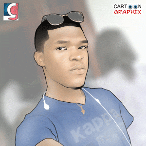
Resource image:


Step 1: Open Photoshop CS6 or any lower version. Open a new file, File > New > Width and Height should be square (that is, of the same proportion) if you are designing for a display picture or social app. But if its just for web, you can make it any size you want.
 
 
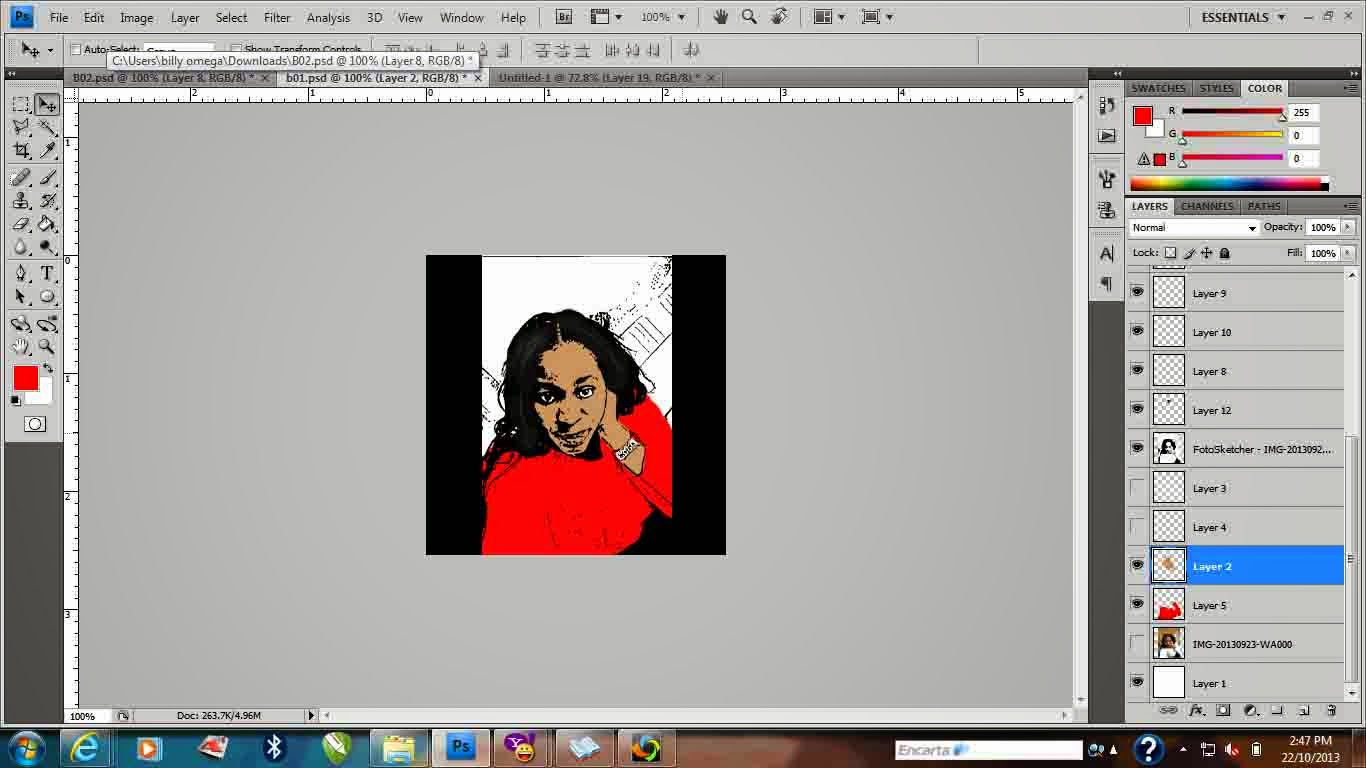
Step 2: We alreadily have an existing white background. Then, create a new layer... Layer >> New >> Layer>>OK. or click on the new layer icon at the layers window as it is in the below image.
 
 
Step 3: Click on File >> Place>> Source for an image you want to animate >> PLACE. Your  image will authomatically be visualised above the white background.
 
 
Step 4: Rasterise the image, there are various ways to rasterise an object. A layer is been rasterised so as to make it accessable for edition. Right click on the layer which contain the image and select Rasterise.


Step 5: The lady on my image opened her eyes and this tutorial is to animate her to make her blink her eyes. The next step, duplicate the rasterised layer. To do that, right click on the layer with the image and press Ctrl + J to duplicate the original image.
 
Step 6: Select the Clone Stamp tool on the tool box. It is a very useful tool in this tutorial and therefore we will be using the clone stamp tool to blend the facial skin color above the eye.
NOTE: uneye the original image. We'll continue to work on the layer we just duplicated.
 
Step 7: The Clone Stamp is a tool not all graphics artist use because it has almost the same effect with the spot healing brush tool. To use the Clone Stamp tool, Press dow your Alt key and click on a spot on the face to identify the skin color then gently apply on the eye.
NOTE: You have to be very careful when selecting a spot to be used. You can repeat clone stamp identification until you get the perfect color for your blend.
 
The whole eye will be covered with the facial color.
Then, the left eye. If you are not concentrating well on the tutorial, scroll up to careful read the steps and procedures till we get to this point. Our main aim of using the Clone stamp is to blend the skin color over the eye of the lady.

 
Step 8: Visualise the original image and uneye the the layer we just used clone stamp on. Select a reactangular marque tool on the tool box and gently drag a rectangular box on the eye. Then, press Ctrl + J to cut out the marque on the next layer.
 
Step 9: The newly cropped right eye layer is to be moved above all layers so as to visualise it on the eye-blended layer.

Step 10: Click on the layer that has the croopped eye. Use the polygon lasso tool to trace out the hair of the eye-lid. This is because in our animation the hair been traced out of the image will be used to help make a realistic losed eye in our animation.

After uing the Lasso tool to trace out the hair. After tracing the upper hair in the eye, press Ctrl + J to duplicate the selection in a new layer. NOTE: uneye the right eye layer to view the new hair of eye-lid layer.

 
Step 11: We need to change the direction of the hair by flipping it vertically. To do that, click on the eye-lid layer Go to Edit, move to Transform then select Flip vertical.
 
Step 12: Visualise the right eye layer to know the exact position your eye-lid should be placed. Press down arrow key repeatedly to place it correcly.
NOTE: When doing this, some images needs the use of rotation to perfectly place them. To do that, press Ctrl + T to transform and then press R to rotate. drag the object to rotate to your best fit.
 
Step 13: Now we got our perfect spot for the eye-lid. we need to make it realistic with some lightening. This is one of the most important part of this tutorial. You must properly note how this lightening effect is been applied. Lightening effects are been applied based on designers styles.
To create a lightening, follow below procedures:
(a) Create a new layer.
(b) double click on the foreground color. (the color below the toolbox)
(c) Pick a white color preferrably
(d) Click on OK
(e) Select a brush.
(f) Change Opacity to 12%
(g) Right click on the image, reduce size of the brush to 30px or more
(h) Change thickness to 0%
 
Then, gently apply lightenings.


We are perfectly done with the right eye. Repeat step 8 - 14 for the left eye. When you are done. you should have something similar to this below illustration. Then we move to animation.
 
Step 15: Merge all layers contributing to closeness of the eye except the original image. We don't want a situation whereby we will be disturbed with the layers to work on when animating. Select all layers except the original image. To do this, click on the top layer, press down the Shift key and click on all other layers except the original image layer. Then, Press Ctrl + E to merge the layers together.

Step 16: Animation is the fianl step of this tutorial. To activate animation, If you are using CS6 for this tutorial double-click on the timeline tab to view the window. For CS5 users and lower versions. To activate animation, goto Windows >> Animation.

Step 17:
You should be able to identify the differences between a layer and a frame set when you are aiming for an animation. The Timeline has an opt for time delay and frames. The frames and the layers have correlations. The first frame should visualise the original image. Then, you duplicate the frame with the icon below the timeline window as shown in the below illustration. Uneye the original image in the second frame and visualise the eye-closed layer. A proper well arranged frame set should appear below:

 The Original image frame should be delayed for 5sec and the eye-closed layer is to be delayed for 2sec.

Step 18: Animations are mostly saved in GIF format. To save an animation on Photoshop CS6 and lower version. Go to File >> Save for web and devices. >> Save.

A final output of the animation.
Contact Cartoon Graphics artist for questions and supports.

Thanks.


Tuesday, October 22, 2013

HOW TO DESIGN A COMIC LIKE CARTOON FROM A REAL IMAGE


Comic Cartoon is an awesome way of making your photos unique and making fun out of them. In this post, we learn the basic steps on how to achieve the below result:

Requirement: Photoshop CS4 or latest, Foto Sketcher software
Level: Intermediate
Result: Comic-like cartoon artwork


Foremost, try to download Foto Sketcher software. It serves an important role in sketchup of the image. Click here to download the fotosketcher software.

The Original image we are working on is the image of an ebony lady. Download the Original image for turorial purpose or try any image of your choice for this tutorial.


Step 1: Open the Foto Sketcher application from the shortcut created on your desktop.
 
Step2: Click on File, Open a picture....Select a picture from the source picture source then click Open. The below diagram should appear automatically. But, if it doesnt. Click drawing parameters noted as 1 in the diagram below. Select drawing style as Pen & ink sketch 2.

Step3: Click on the draw as noted in the below picture.
 Step 4: The fotosketcher automatically sketchup your image into a comic-like sketch. NOTE: When loading, do not interrupt processing.
Finally, the Sketch should look this way. Press Ctrl + S to save the sketch. We then, continue on photoshop CS4 for coloring and final rendering.

Open your photoshop CS4 or any newer version.
Step 5: Create a new page of 300 x 300 pixel with resolution of 300. you can choose something different. But, its best to follow this tutorial if you are just learning cartoonizing. Click on File, select Place and select the fotosketcher image from the source.

Step6: There is so much space by the edges. Use the rectangular marque tool to form rectangles at edges to make the image look centered in the page. Make sure you are doing this on a seperate layer.

Step 7: Click on the fotosketcher image layer, set blending mode to multiply as noted in the diagram.


Step 8: The next is to give the image a skin color. Click on the set forground color (1), a color picker dialogue box is displayed, select only web color to make you pick from better ranges. We are using a brownish color because we are working on an ebony. If you are having difficulty selecting a color, untick the web color and select better from ranges.


Step 9: Use the brush tool to color the skin in the picture including the d face. NOTE: Do not paint the eye, the lips color is always different so make the lips an exception too. All this is to be done on a new layer.
 
 
Step 10: Create new layers to paint the wears and the wrist watch she is putting on. I decided to use a red wear because red wears are always flashy and the best color to make a cartoon more attractive. there are so many colors that can make your cartoon more cool. designers discretion can be used to apply colors but you dont want a situation where the colors affects each other. NOTE: Apply colors wisely.


Step 11: Add lightening and reflections to your image to make it look more attractive. Select a white forground color, select the brush tool, reduce opacity to 12%, right click on the page to set master diameter ranging from 1px - 2500px. NOTE: the hardness must be in zero.
 
Step 12: Apply refelections wisely...its better to always take a look at the image again when applying reflection so as apply correctly. NOTE: reflectons should be on another layer to enable ease blending of corrections and additions.
 
Save your image. then, you should av a comic like cartoon.
 
Result:
 
 
The result should appear cool in jpeg format or any other graphical format of your choice.
Thanks.
If you have questions. Kindly send your message to Cartoon Graphics.


Thursday, September 19, 2013

CARTOON GRAPHICS ARTWORKS

It has obviously become habitual that the cartoonized images have taken over profile pictures and blackberry messenger display pictures due to the uniqueness of this image to the users family and friends.

These are samples of the awesome animations and artworks.


You can design yours by adding pin: 22E16FF1 or by following on twitter: Laycon11
If you are interested in learning how this animations are been designed. Send ur email to lekzysalams009@yahoo.com.
 
Thanks.


Sunday, March 24, 2013

Line Art Tutorial Recommended for Intermediate Level Photoshop Users

This is a post Cartoon Graphics® came across on a very popular website www.melissaevans.com, useful for Cartoonizing images using Photoshop.

An image of Scarlett Johansson Line art.


First up I’d like to ease your mind and let you know that you don’t need to know how to draw to complete this tutorial. It’s basically tracing, except that tracing is alot easier in Adobe Photoshop. Creating line art with this technique will take several hours to do a good job…if you want a tutorial that just applies a couple of filters, then this tutorial is not for you!

1. Preparing the Layers

Open your photo in Photoshop. Rename the layer “original”.
If your picture is quite dark you will need to lighten it a little. The reason for this is that we will be tracing over the photo in black so we need to be able to see the lines we are creating clearly.
Adjust Brightness and Contrast in Photoshop
Adjust the Brighness of the photo
Image >> Adjustments >> Brightness/Contrast…
Scarlett Johansson
Duplicate the “original” layer. Rename this new layer “top”.
Create two more new layers. Place them under the “top” layer.
Fill the layer closest to the “original” layer white and rename it “background”.
Leave the other layer transparent and rename it “line art”
Turn the visibility OFF for the “background” and “top” layers.<
Visibility ON for the “line art” and “original” layers and the “line art” layer is active. See image below.
(All this organisation will be explained soon).
Creating Line Art of People with Photoshop 08
We are now set to create the line art.

2. Brush Tool Settings

When creating line art you want to vary to thickness of the line (line weight). Varying the line weight emphasizes the perspective of the drawing. As lines become closer the viewers the lines get thicker. Lines taper towards the furtherest part of the object. The image below shows an exaggerated example of this. Also areas that fall into shade can have a heavier line, while areas in light can be represented with a thinner line. A good way to get better idea of this is by studying the line art of comic books.
Another technique is to use just two line weights. A heavier line is used for the outer edges of the object and all internal lines are a smaller size. I’m not a fan of this style but each to their own, as long as your picture doesn’t look flat.
Line Art Line Weights
To taper the lines in Photoshop we need to adjust our Paint Brush Settings.
Click on your Paint Brush tool. We need to adjust the brush presets.
In older versions of Photoshop (CS2 and earlier) click on the brush palette tab at right top of your photoshop screen. See image below.
Adjusting Brush Settings
In CS3 onwards your brush palette is available by clicking on the pallete icon on the top or see image below..
Photoshop CS3 Brush
The settings you use are going to vary with each line you create, especially the diameter. Below shows one Brush Tip Shape I used.
Photoshop Brush Controls
Next click on the Shape Dynamics.
  • 1. Set the Control to Fade. (This will allow our line to taper).
  • 2. Adjust the fade setting. (I’m using 250 here but try experimenting with various combinations of 2 & 3).
  • 3. Adjust the Minimum Diameter. (I’m using 27% here but the key to great line art is variety so experiment).
Black as Foreground Colour
Make sure your foreground colour is black. See image above.

3. Creating the Paths

The best place to start is the center of focus, which is normally the face. Since I’m using an image of Scarlett Johansson I’ll start on her lips.
Remember the point where you start the path is going to be the thickest.
Make sure the pen tool is set to Create New Work Path. See below.
Create a Path in Photoshop
Create a path paying attention to the angle of the curves.
Note: Keep the distance of each line rather short. Don’t try to create one line to go right around the lips.
Creating Line Art of People with Photoshop 09
Once you are happy with the path, right click and select Stroke Path… See below.
Photoshop Stroke Path
Turn ON the visibility of the white “background” layer. Delete the path (right click and select Delete Path).
Now you can clearly see the line you have created.
If you are happy turn OFF the white “background” layer and create the next line.
If not use your History Palette. See image below. By clicking here you can adjust the curve or paint brush settings.
Creating Line Art of People with Photoshop 12
If the line is only slightly off you can use the Eraser Tool. Rather than using the eraser tool in a up/down motion, move it on a diagonal to the line art. That way the line will have a tapered effect at the end. See image below.Creating Line Art of People with Photoshop 11
To create a line that is tapered at both ends like the one shown below. In the brush Shape Dynamics Window change the Control from Fade to Pen Pressure, and the Minimum Diameter to 1%. See second image below.
Creating Line Art of People with Photoshop 13b
When you select Stroke Path this time check the Simulate Pressure box. See image below.
Creating Line Art of People with Photoshop 14
Once you have finished creating an item, like the lips, it’s important to check them against the original. Turn the visibility ON for the white “background” layer. Turn ON and OFF the visibility of the “top” layer. If it looks like the lips are “jumping” then you will need to adjust the line art.
To create very thick line areas, such as the eyebrows shown below, we create a closed path and choose Fill Path instead of Stroke Path. (A closed path means that there should be no ends to the path, like a circle.)
Creating Line Art of People with Photoshop 15
The image below shows the upper eyelash path I created. I also used Fill Path here.
Creating Line Art of People with Photoshop 15b
To create shapes that are round, square, oval, etc remember to use the Shape Tools. (Found next to the pen tool). The image below shows how I created the iris outline using the Ellipse Tool to save time.
Creating Line Art in Photoshop Tutorial
I guarantee that you will get faster and faster at this technique of creating line art in Photoshop, so stick with it.
Scarlett Johansson Line Art Created with Photoshop
Cartoon Graphics ® agent Blackberry pin: 22E16FF1